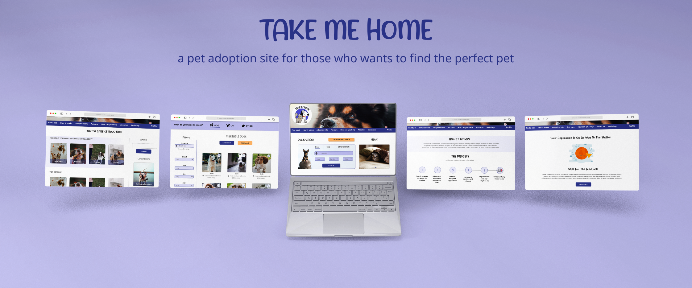
“Take me home” is a website for those who want to adopt a pet and would like to see many shelter’s and rescue’s pets together in one place.
There are many shelters and rescues in the country who want to find a home for their pets on their own platform. At the same time, there are many people who want to adopt a pet and find the perfect one. The problem is that people do not know all shelters or do not have the time to browse through all shelters’ page.
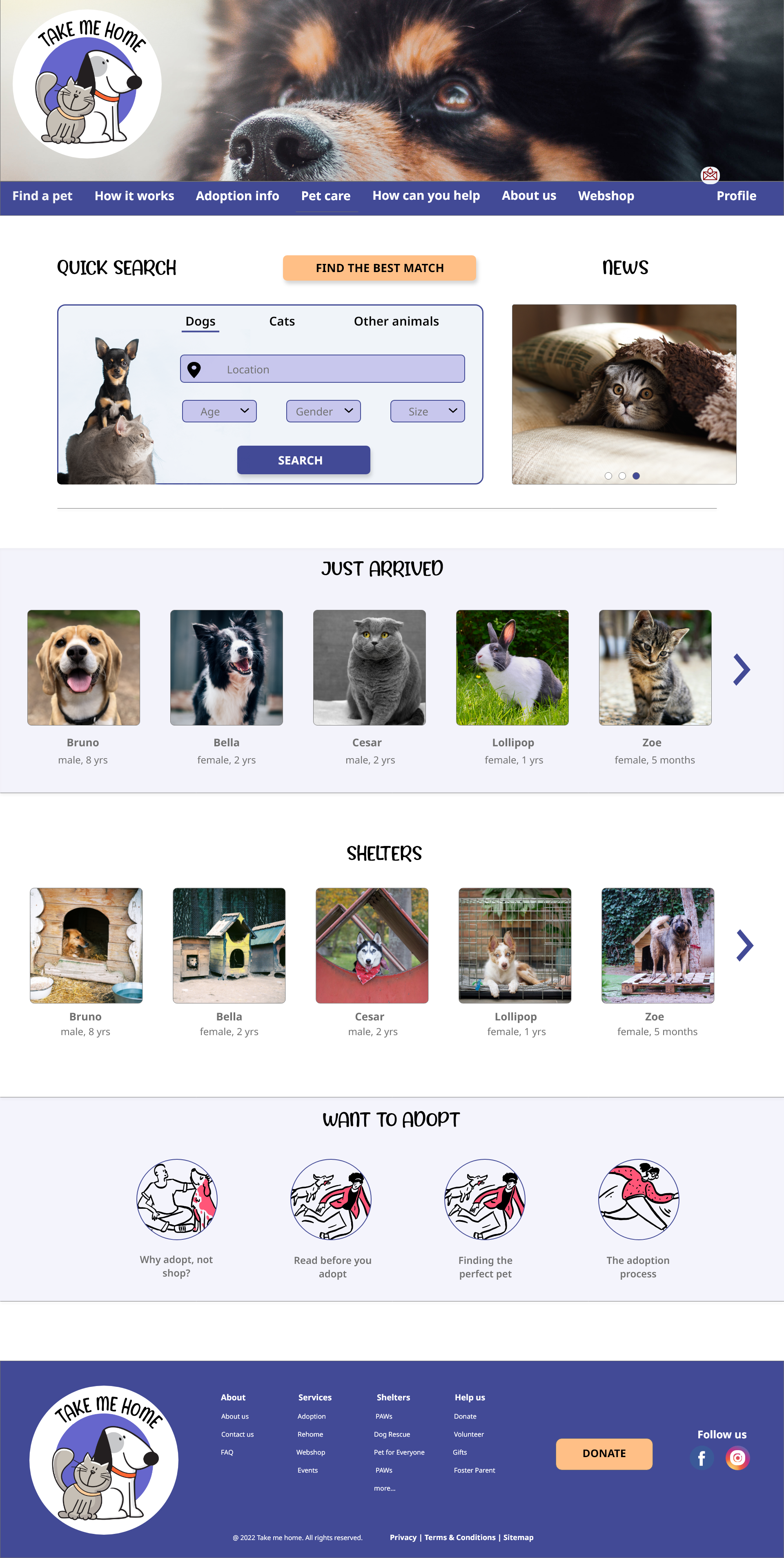
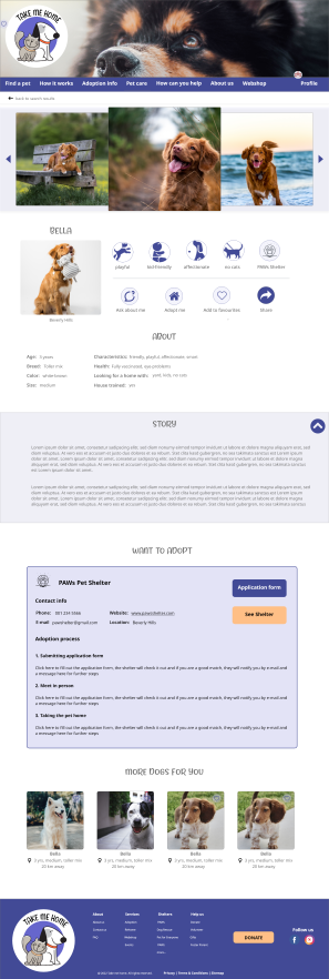
The solution to tthis and also the goal is to create a platform where all registered shelter can upload their pets with their characteristics. Through this site, people can browse through many pets' profile to find the perfect one. A simplified application process would help the applicant and the shelters too.
February - 2022
I conducted a user research to understand users’ needs, pain points, thoughts and feelings about the pet adoption processes.
I interviewed 5 person and also conducted a survey among people who want to adopt a pet. The goal of the research was to find the users pain points about adoption processes (e.g how to find the pet, procedure etc). and also the features they would like to have when looking for their perfect pet.
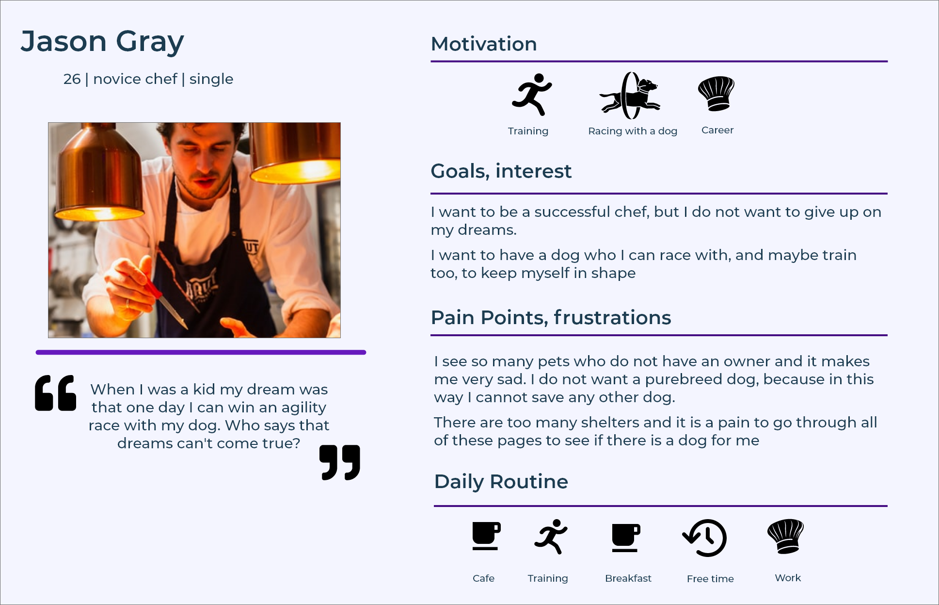
After the research and interviews I got a good picture about the potential users and their diversity. To be able to further empathize, I created several user personas and problem statements. The above photo is one example of the personas.
The problem statement:
Jason is a young chef, who needs a site where many dogs can be found, because he wants to find the perfect dog to do agility races with it and pursue his childhood dream.
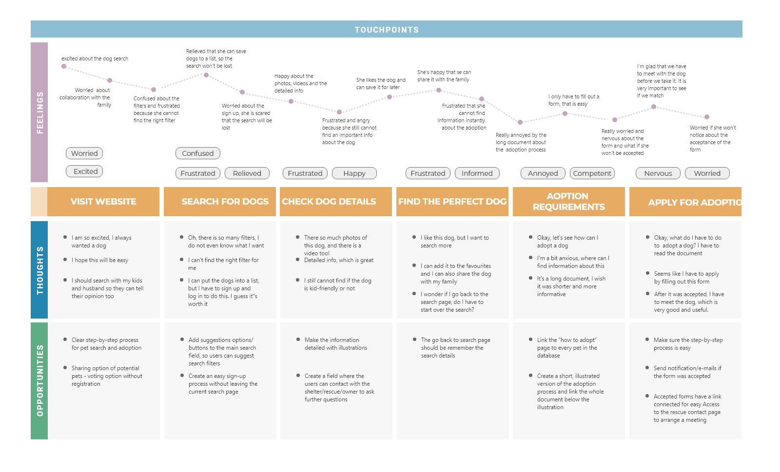
Creating a user journey map helped me to pinpoint user pain points and come up with solutions to those frustrations. Many opportunities were identified that was helpful during the design phase
Based on the research, competitor analysis and the user journey maps, I collected all the potential information and features the site might be needed and created a content library.
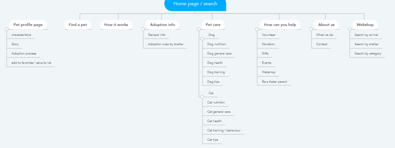
I also created information architecture and a site map that guided me through the wireframing phrase.
After creating many-many variations of each screen on paper, I selected those parts that I liked the most and turned them into a digital format.
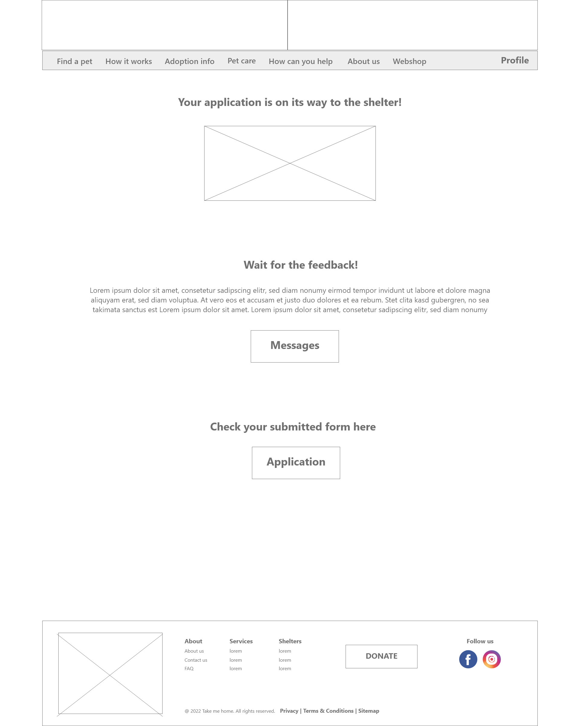
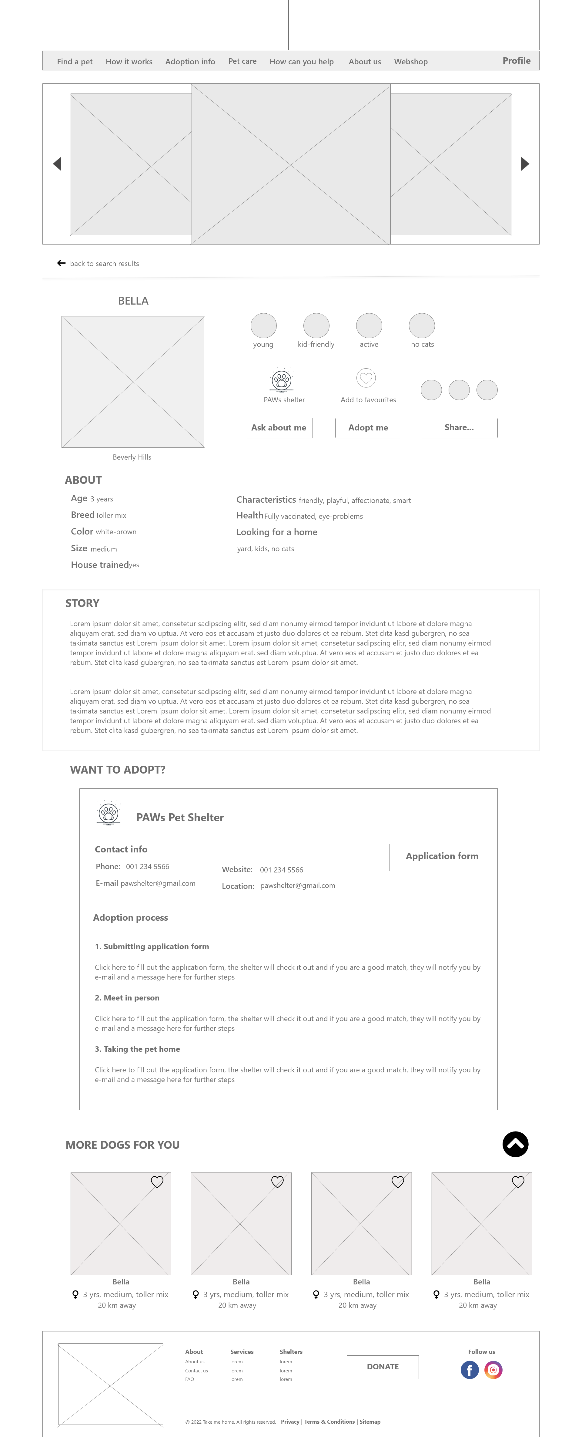
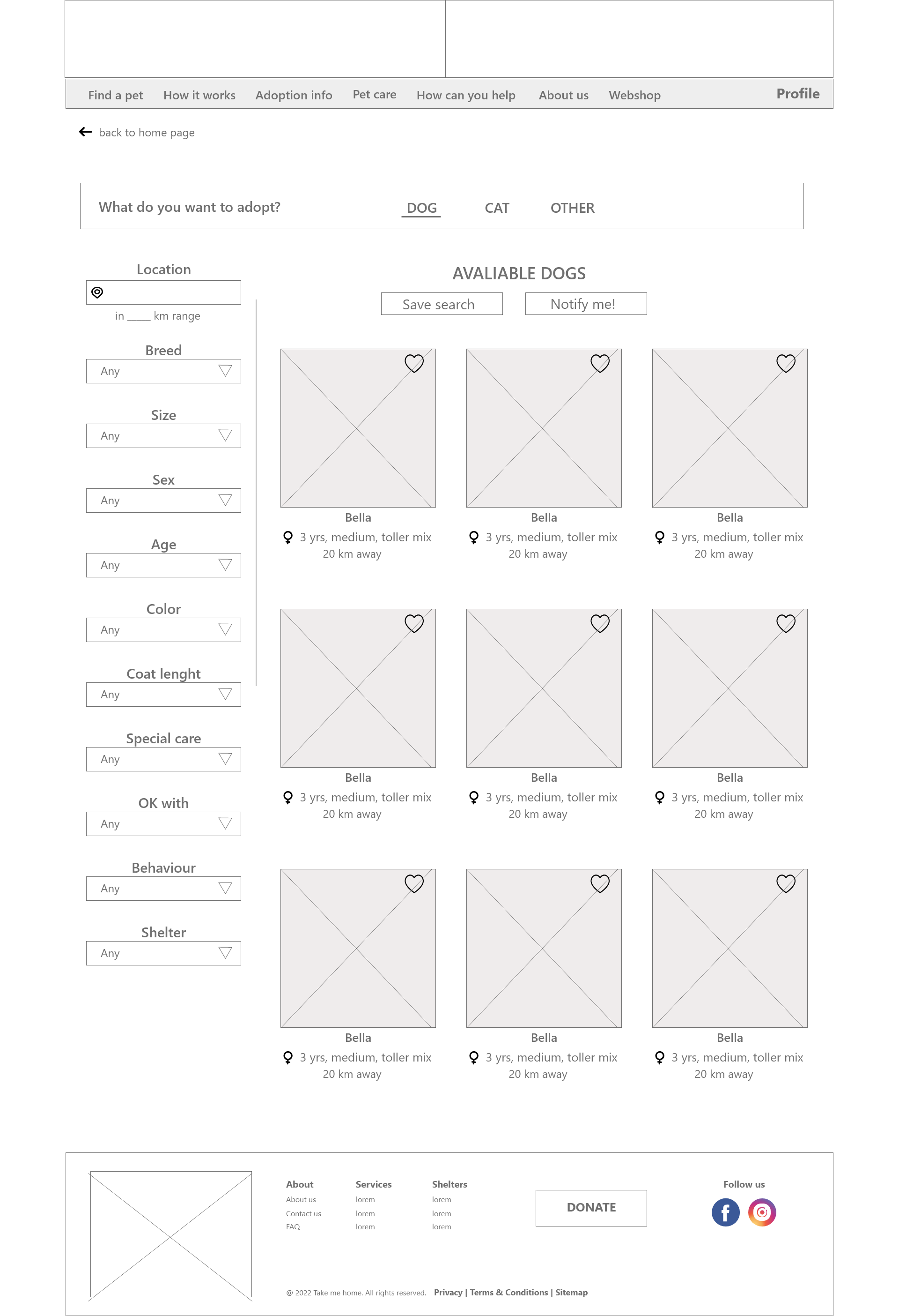
After I finished the low-fi wireframes and turned them into a prototype, I conducted a usability study to see how the functions work, what are some frustrations with the page and what can be improved based on the comments, heatmaps and feedbacks I got.
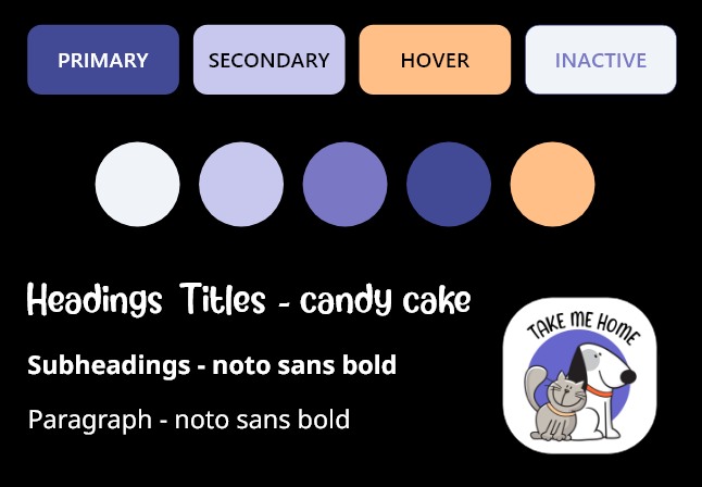
One of the most creative part is when I can turn low-fi prototypes into hi-fi ones. To do this, I created a design system where I chose all the fonts, colors and created sample buttons, headings, paragraphs and the logo.

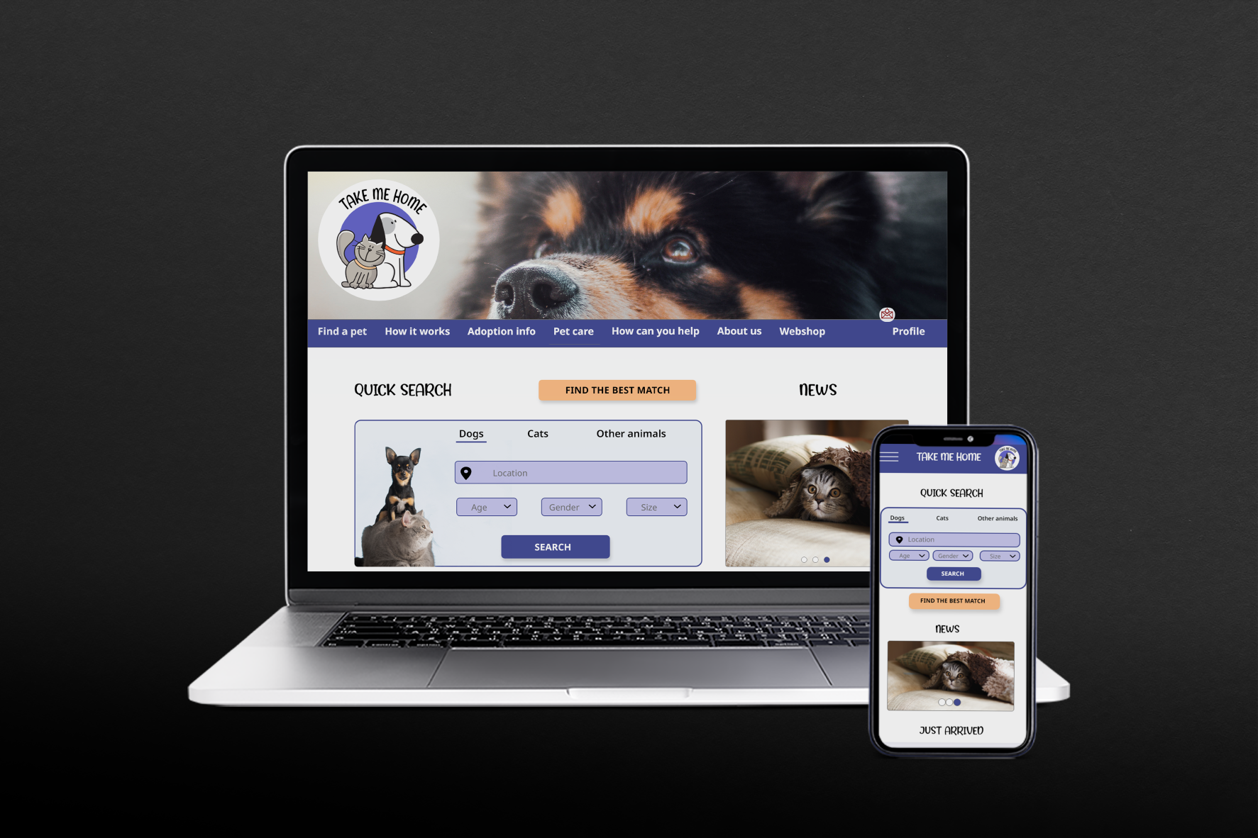
As nowadays many people use their mobile devices to surf on a website, it is inevitable to design for multiple screen sizes.
As this was a practice design, I learned a lot, but we all learn all the time. The most challenging part was the research and the usability study because it took some time to find a righ number of customers from the target group. I also learned that this is a part where you cannot be rushing and make up things because that would not represent the consumers.
As for the design process, designing a responsive site was another important aspect of the learing curve in this project. It does require real work and dedicated time to go through different screen sizes and optimize your design for smaller screens too.