Don’t go extinct is a site and an app that helps educate and inform people about endangered species and all the ways that we can help. The site also has an application with more engagement and action: people can do quests and set goals,objectives to help endangered species survive
In our developed, developing and rushing world more and more species get closer to extinction. Many of the reasons can be reversed if people would be more conscious and educated about the world around them. Currently there is only a few organization worldwide that take serious steps to tackle the problem with more education and little engagement
The goal of the project is to create a platform where people can learn not just about endangered species, but all the ways that we can help to solve this crisis by changing little things in our everyday life, or our travel style. To make this more appealing, the platform, especially tha application should also engage people to keep them active.
March - 2022
To understand the motivations and the pain points of people, I conducted an interview and also a survey.
Through the interviews I wanted to find out how people feel about endangered species and what are their motivations when it comes to saving them. I also wanted to understand what are those things that keeps them away from helping.
Through the survey I wanted to ask many people what information are they interested in and what activities would they see in a site like this.
From the research I realized that people are undereducated in this topic and sometimes they do not even know what they would like to know or what would be interesting for them.
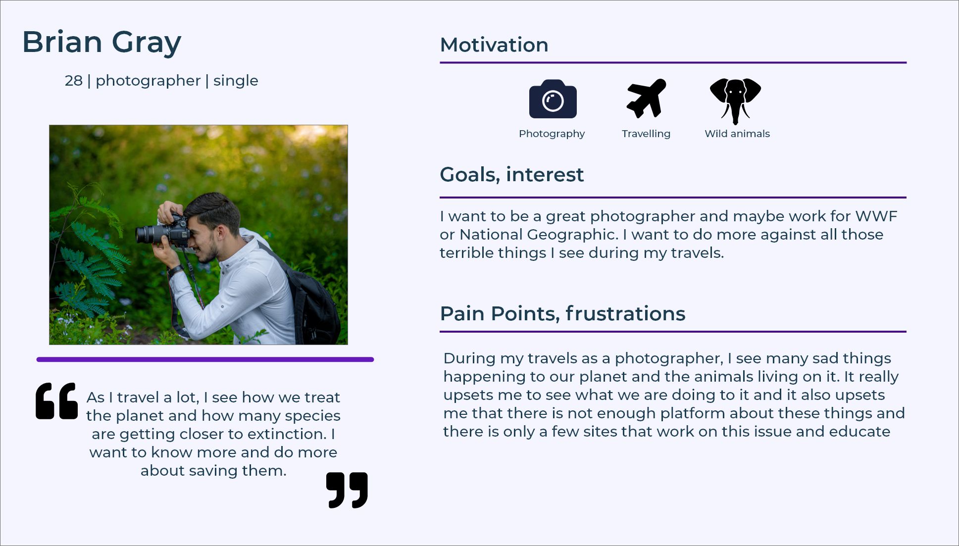
After the research and interviews I got a good picture about the potential users and their diversity. To be able to further empathize, I created several user personas and problem statements. The above photo is one example of the personas.
The problem statement:
Brian is a photographer who travels a lot, and needs a platform where he can easily find information about all the ways he can help to save species close to extinction because he wants to do something against the current state of the planet
As there are many types of people who would be interested in saving species in their everyday life and during there travels, I created several emphathy maps to understand more what kind of people would use the app and the site and what would be there thoughts and feelings
Because people have little information about endangered species I planned to create an informative site with full of resources, especially for children, so teachers can use them.
On the other hand, people want to have information in their pocket and because using a mobile phone is cruicial part of our lives, I decided to create an app with instant information and engaging activities to keep people active.
First, I needed some ideas how to achieve the goal of the project and I spent a relatively good amount of time brainstorming and finding the best solution. During the ideation phase I used method such as the Crazy eights and ‘How might We’. It gave me some ideas that can be implemented to the project and engage people.
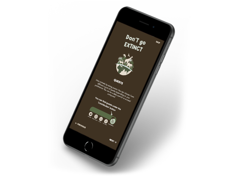
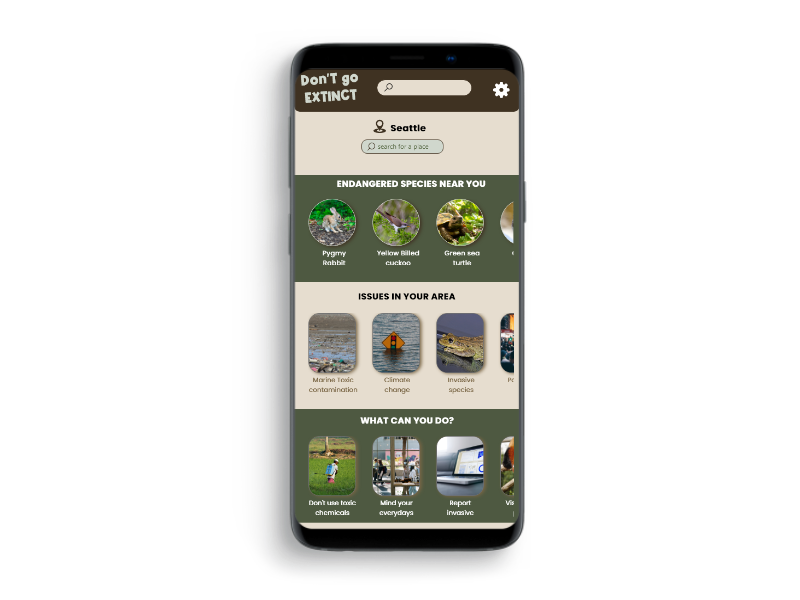
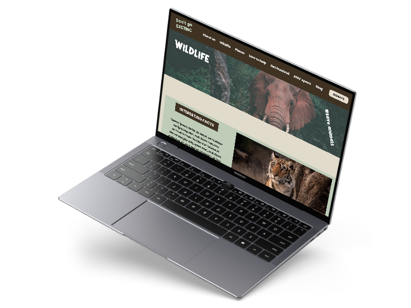
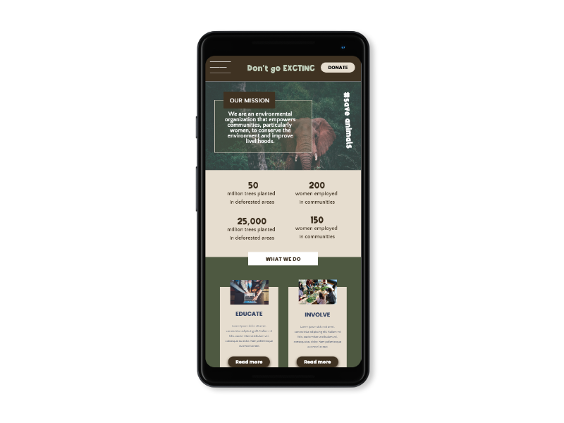
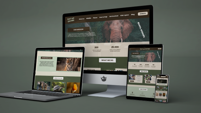
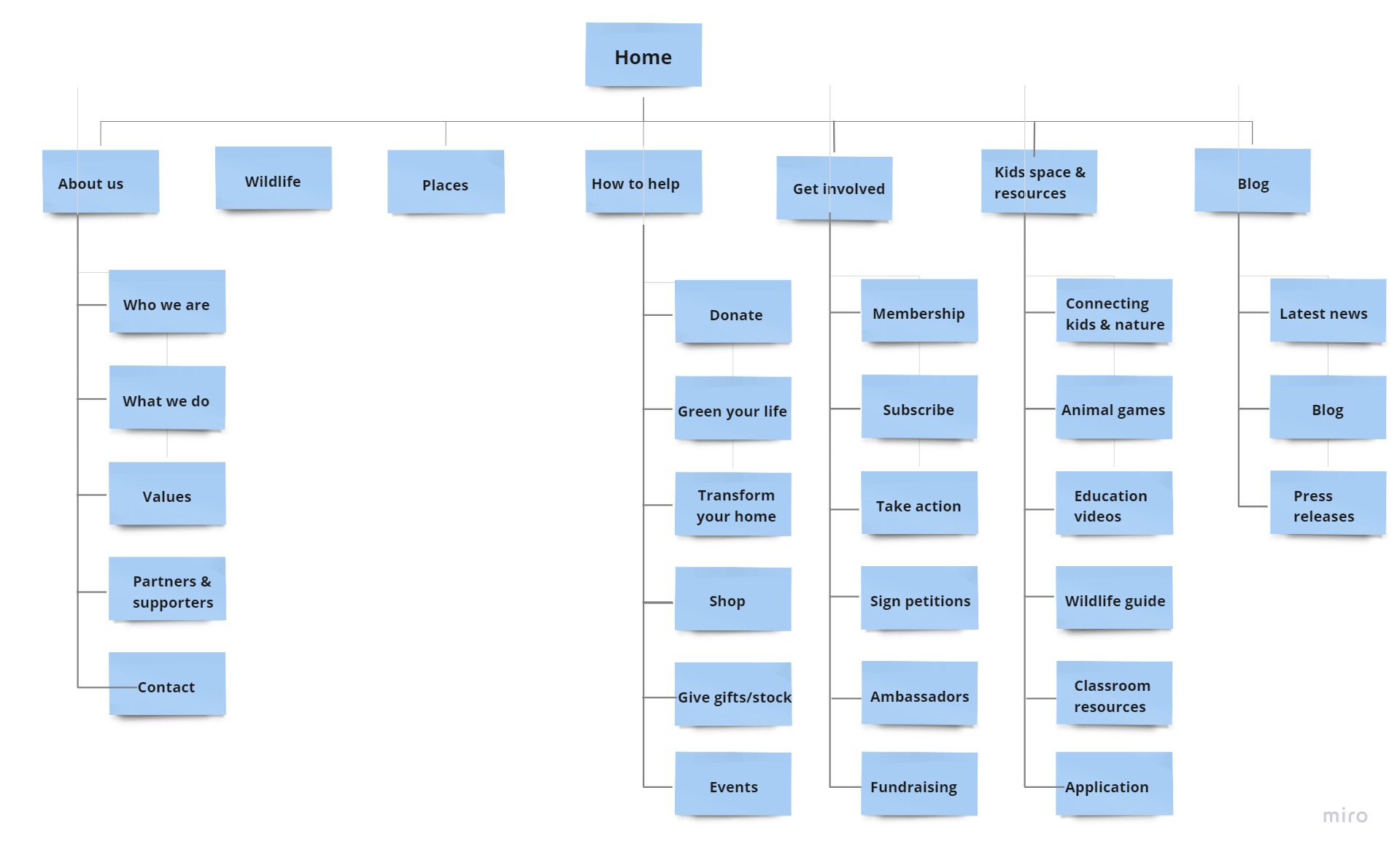
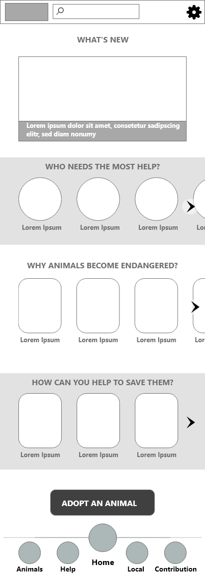
After that, I created the paper and digital wireframes for both the app and the website. Based on the facts that people are interested in information about endangered species and are willing to dedicate time to save them while travelling, a travel-friendly page was created with local informations. A nav bar provides easy navigation between these information. Please see some photos below.
During the usability test, I found many-many things in the app that should be changed, therefore I had to iterare my designs multiple times.
Some things that needed to be changed:
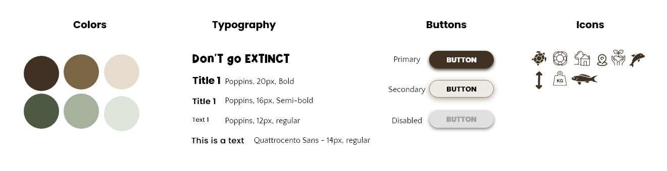
After I iterated the screens of the low-fi prototype, it was time to make them look appealing and real. As usual, my first step was to create a design system what I follow throughout my work.