I chose to redesign the Hungarian geocaching official website to give it a more modern look and also add some very important features that were lacking according to the Hungarian users. The project is not all-inclusive but highlight some opportunities to improve.
Geocaching is a popular game all over the world, but the Hungarian official website is really old-fashioned and lacking some important and useful features. However, the site is also used by older people who are not familiar with modern designed pages.
Keeping usability in mind, the main goal is to solve the major pain points and create a more user friendly, intuitive, better designed website.
May - 2022
I talked to several people in the geocaching community and read all the comments in the "suggestions' page of the website. The users I interviewed were people who just get started, people who often go geocaching and people who are only playing the game a couple of times a year.

I created user journeys based on personas. This allowed me to identify and define those points where the user experience can be improved.
This way I could understand more deeply WHY people visit the site and not just what do they do on the site.
I prioritized the users' pain points to focus on the most important issues that come up. Based on the previous research and customer journeys, the most important pain points to focus on is the responsiveness and the feedback on the logs.
Based on the identified issues and the understanding of why people visit the site and what do they want to do, I started to reorganize the site content, creating structure, grouping elements that belongs together. I focused on the necessary information and simplified the navigation according to them. However, I did not want to drastically change what people can see on the pages because old users can feel uncomfortable learning a new site with new pages and new structure.
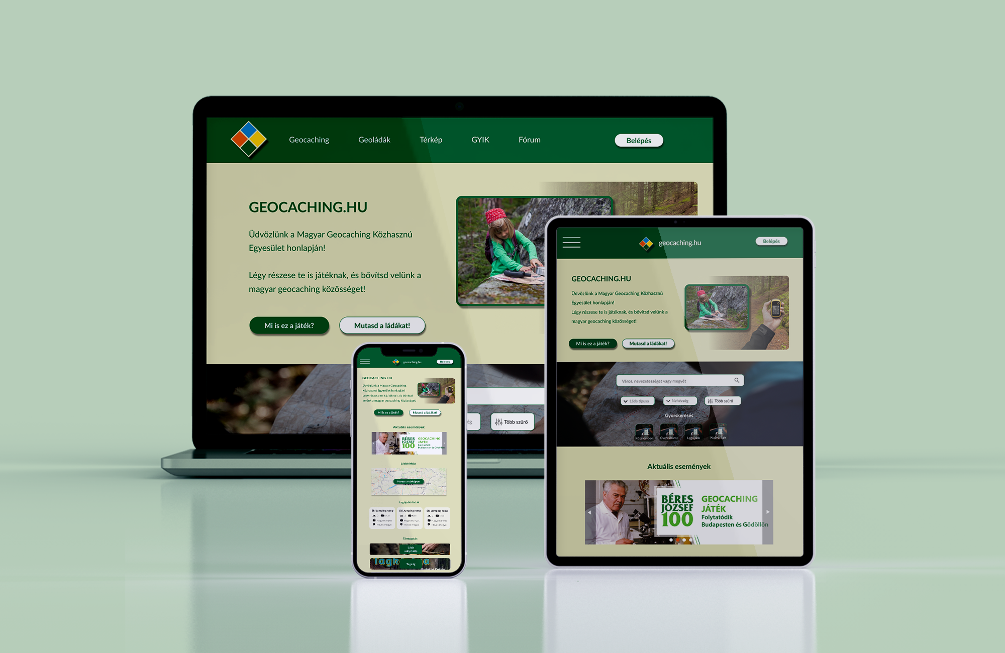
As nowadays many people use their mobile devices to surf on a website, it is inevitable to design for multiple screen sizes.
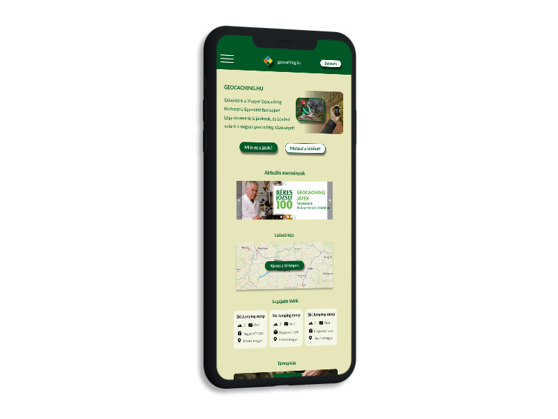
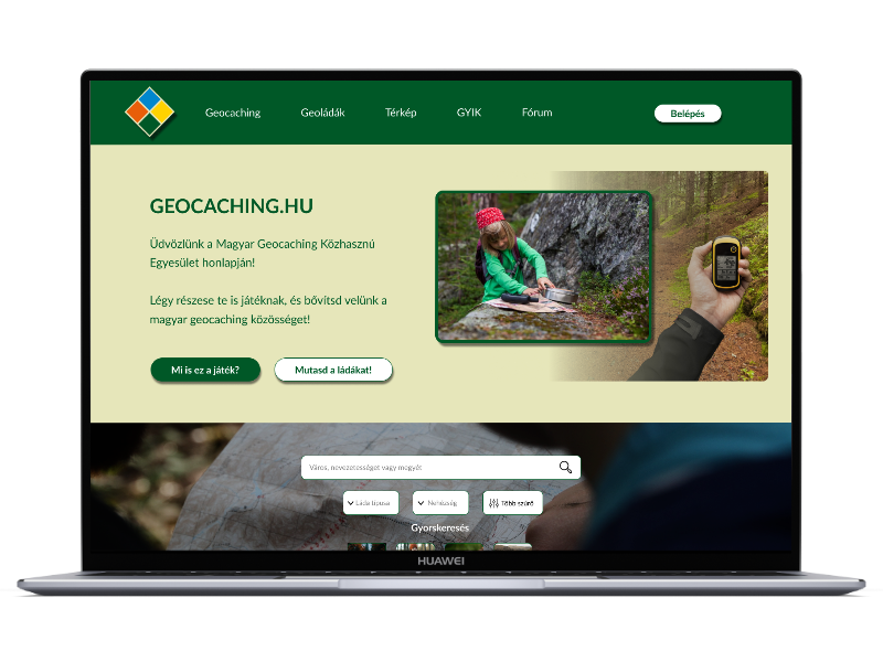
I started the redesigning with the home page, where I added an information section for those who are new to the game and to the site. An extended search element was added next, with more filter options as the main reason why people go to this site is to look for caches they can find.
I wanted to keep all the important information from the website but I also wanted to declutter it. I changed the unorganized info elements and randomly added photos, new caches and news, so it is easier to find information.
Main changes on the home page:

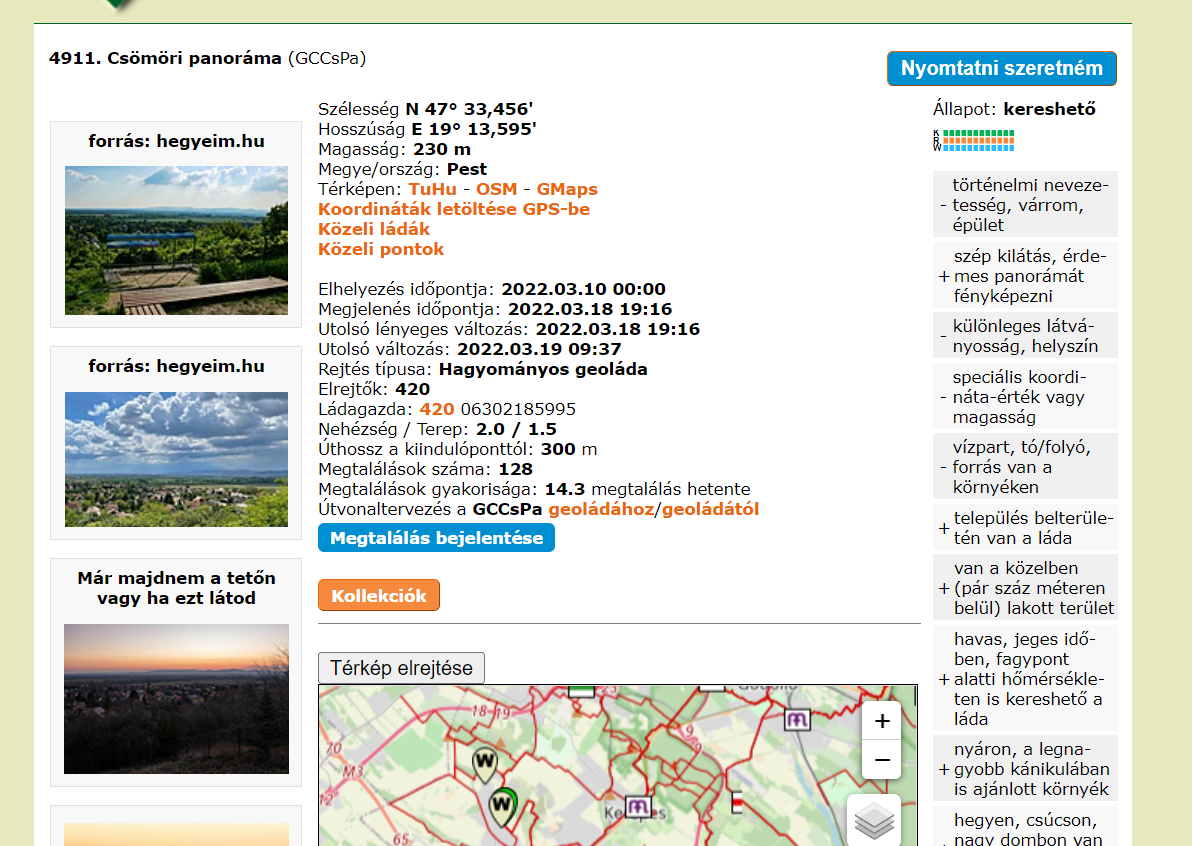
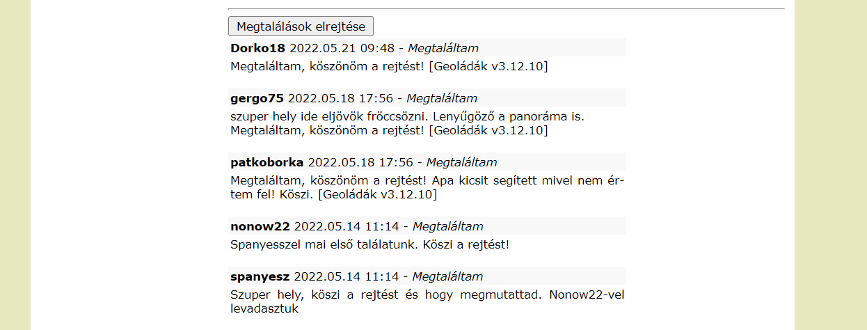
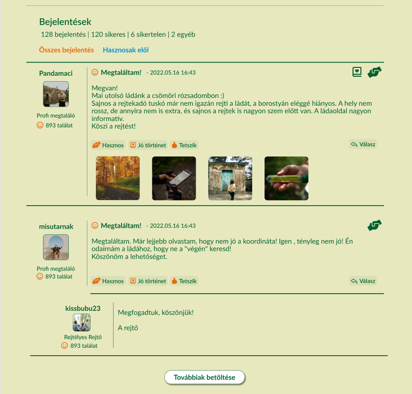
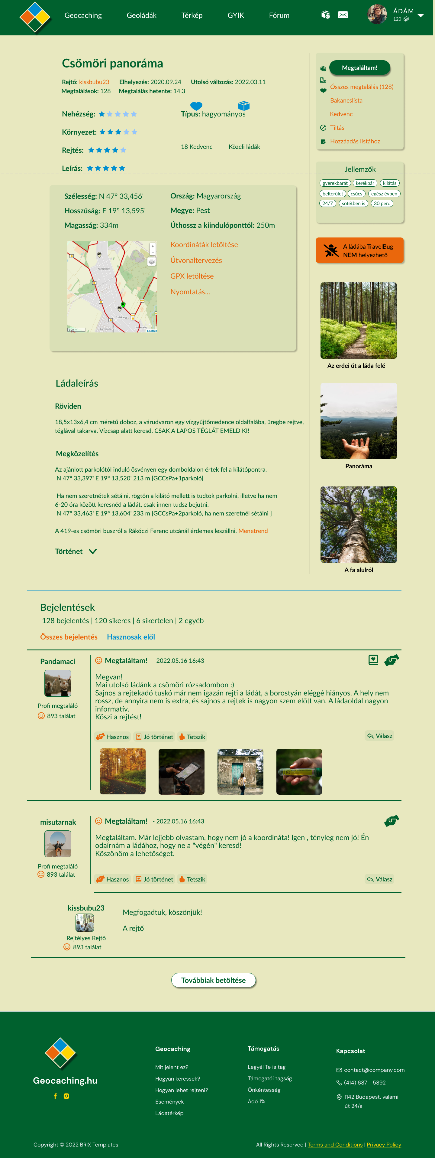
The geocache page is one of the most important page as it shows all the information and logs of a cache. During the research it was clear that the main problem was with the logs: it is shown in a chronological order and the useful logs are often lost. Adding a rating option would solve this problem.
Main changes on the logs:
Main changes on the cache page:
A small box allows customers to save, add to list, ignore or log the geocache. Below that the tags show the most important characteristics of the geocache.

The geocaching site was a very interesting choice to redesign. As the site itself looks very old-fashioned would have been very easy to focus on the design elements and create a modern looking site. However, the design is just one part of the process and I really need to keep the focus on usability issues.
My takeaway from this process is that you really need to get to know your users and keep usability in mind even if there is room to improve the design too. A complete redesing needs a lot of work and you must listen to the users. You have to keep what is right and change or add things that makes the site more intuitive and easier to use.