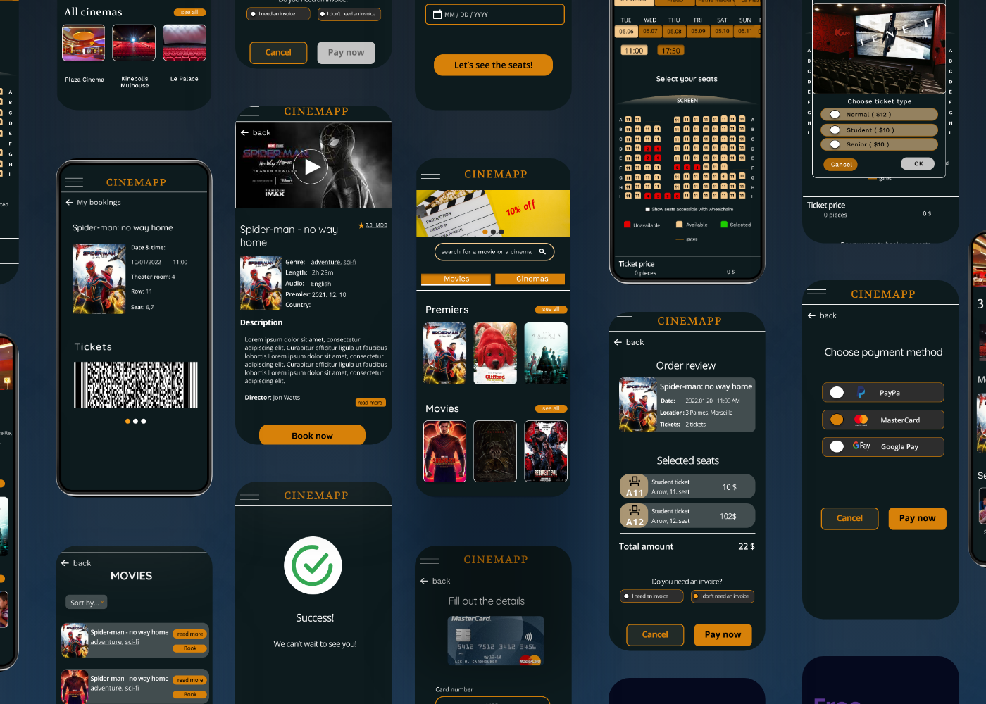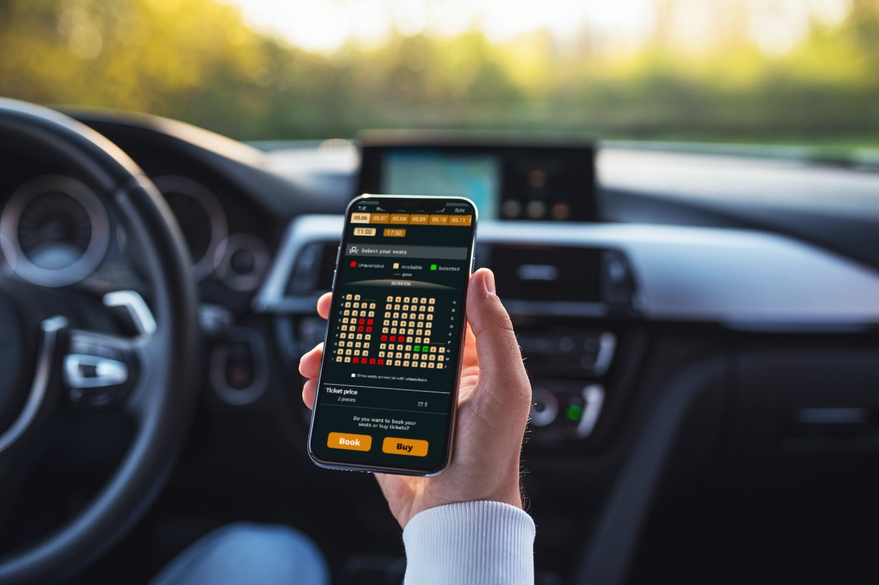

An app for movie goers who would like to buy tickets or book their seats in advance. The main goal for this app was that users can quickly and easily book or buy tickets for the movie.
There are only a few apps that can be used for booking or buying movie tickets so users have to buy it on the web or wait in lines before the movie. Although responsive sites are one way to buy or book tickets on the go, a dedicated mobile app would be easier to use.
The goal is to create an easy-to-use seat reservation app with the function of buying tickets. The app should have clear instructions and quick process.
March - 2022
To understand the motivations and the pain points of people, I conducted an interview and also a survey.
Through the interviews I wanted to find out how people feel about endangered species and what are their motivations when it comes to saving them. I also wanted to understand what are those things that keeps them away from helping. Through the survey I wanted to ask many people what information are they interested in and what activities would they see in a site like this.
From the research I realized that people are undereducated in this topic and sometimes they do not even know what they would like to know or what would be interesting for them.
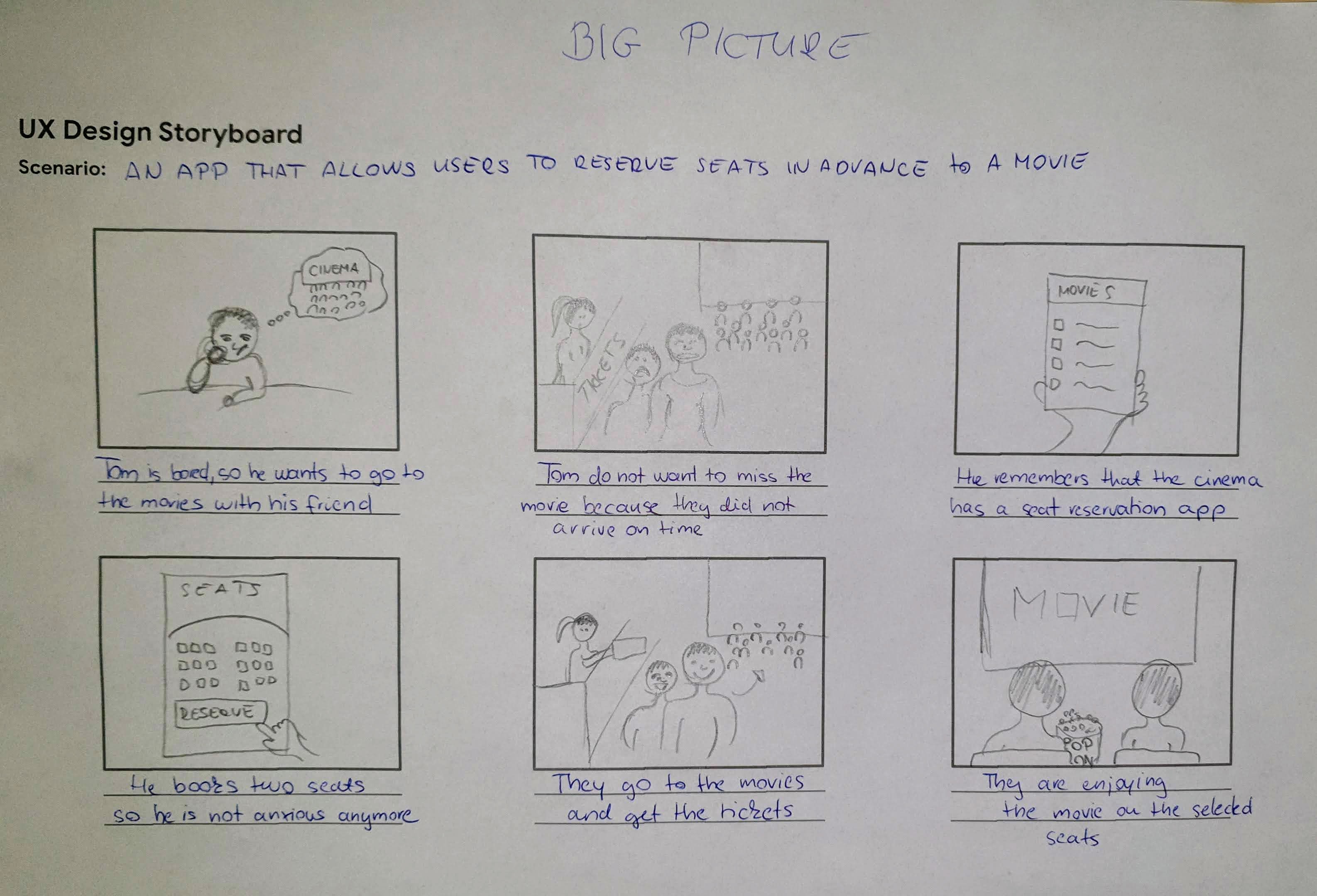
After the research and interviews I got a good picture about the main pain foint of the user. Before I created ideas I also created sotryboards to illustrate what is the problem I want to solve. The personas also had a problem statement
The problem statement:
Tom is a Tech-savvy university student who needs a movie theater seat reservation app because he would like to make sure that he will have a good seat to have the best possible experience
Customer journey and identifying the opportunities
I created a journey map to realize frustration that may come up and try to find solutions for them. Some of the point I highlighted was: easy to find app name, low data usage, seat ratings, clear markings of empty seats, clear indication of prices, send confirmation through the app and also through e-mail.
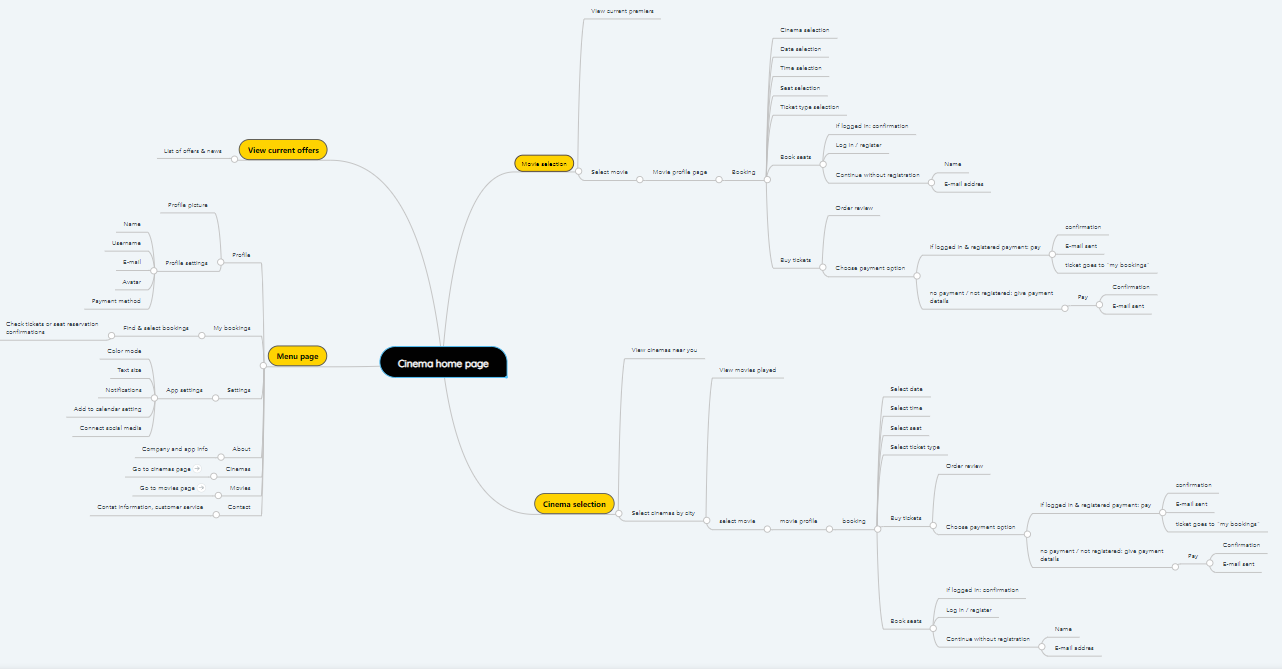
I started the design process with generating user flows, content libraries, information architecture and mind maps. This helped me to see what are the main elements that solves users’ problems and easy to follow.
To see the structure of the app I created a mind map that provided tha base when starting to ideating and designing paper and digital wireframes.
First, I needed some ideas how to achieve the goal of the project and I spent a relatively good amount of time brainstorming and finding the best solution. During the ideation phase I used method such as the Crazy eights and ‘How might We’.
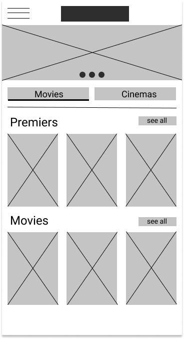
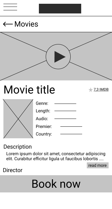
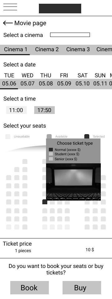
I created several wireframes on paper, so I can select the parts that I really like and put them together. Then I turned them into digital wireframes and connected the pages to have a low-fi prototype.
After creating the wireframes I conducted an unmoderated usability study with 10 people. I recorded their thoughts and clicks on the app. Their task was to select a seat, buy ticket and then check their bought ticket in the app.
Some things that needed to be changed

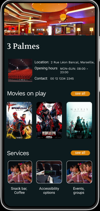

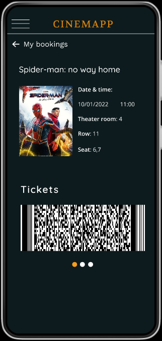
From this project I learned the importance of user feedback in the earlier phases as this saves you a lot of time and work. Iterating is actually a good thing because you can improve your designs. In fact, usually the end-design looks differently than the wireframes. I learned a lot about design systems, color shemes and other UX principles, but I also realized that I still need to improve (which I'm so excited about).
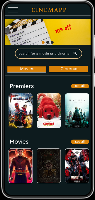
Creating mockups that speaks also cruical because this way you can show your stakeholders what was your purpose and what were your initial thoughts.
